
Risk matrix Excel template: scored twice, before and after treatment
A register where you write cause, event and consequence, two scores from 1 to 5, and the severity works itself out. Then the same two scores once the action is done, so you can see whether it changed anything.
The idea: a matrix is not there to file risks away
It is there to decide which ones deserve your attention.
One score says nothing, two scores rank
A very likely but harmless risk does not deserve the same effort as an unlikely one that would cost you the project. Crossing probability and impact settles that in one multiplication, and the matrix makes it readable at a glance.
A badly worded risk cannot be treated
“Risk of delay” calls for nothing. “If the supplier underestimates the effort, testing slips by two weeks, and go-live lands after the change freeze” calls for three things. The workbook separates the cause, the event and the consequence to force that precision.
An action plan nobody measures is an intention
Most registers stop at the first assessment, then list actions nobody comes back to check. Scoring each risk again after treatment changes the nature of the exercise: the actions that move nothing show up immediately.
What the workbook contains
Five tabs, no macros, everything visible and editable. The calculation cells are locked so a formula does not get wiped by accident; the input cells stay free.
Two matrices, before and after treatment
The same five by five grid, drawn twice. On the left your risks as they stand today, on the right as they will be once the actions are done. Each cell carries the number of risks it holds and takes its colour from your thresholds. If the cloud does not move down and to the left, the action plan needs rewriting, not following.
A register that scores twice
Sixty rows, with cause, event and consequence kept apart, the response strategy, the action, the owner and the due date. Then the same two scores after treatment. Severity and level are calculated on both sides and coloured the same way, which makes the gap readable row by row.
Scales that say what they measure
Both 1 to 5 scales are documented, not just numbered: “has happened on a comparable project” for a probability of 3, “a committed deadline is at risk” for an impact of 4. That is what lets two people score roughly alike. The four severity thresholds are editable, and every colour follows.
A dashboard counting what stays open
Number of risks, how many are high or critical, average severity, and the drop obtained by the treatment as a percentage. Below, the split by level before and after, the load by category, and the ten most severe risks, ranked. A high risk with no action written is flagged in red in the register.
A useful register is not a long one. It is one where every row has moved since the last review.
How to use it
Five steps. The last one is the one almost nobody does, and it is what makes the other four worth doing.
Projects fail before execution
Among failed projects, the most cited causes all sit upstream. Multiple-choice answers: the percentages do not add up.
- 35%
inadequate requirements gathering
PMI, Pulse of the Profession 2018, 4,455 practitioners - 29%
inadequate vision or goal
PMI, Pulse of the Profession 2018 - 28%
inadequate cost estimation
PMI, Pulse of the Profession 2018 - 26%
poorly identified resource dependencies
PMI, Pulse of the Profession 2018
Where this workbook stops
A register on a spreadsheet holds the first workshop well. What kills it afterwards has nothing to do with Excel: four things the format cannot carry.
The spreadsheet cannot tell whether your 4 is a 4
Two people rarely score the same risk identically, and no formula reconciles that gap. The documented scales in the workbook reduce the spread, they do not remove it. Only an assessment with several voices does, and that is a meeting, not a file.
No risk is attached to a task
You know a supplier delay is critical, but not how far it would push the delivery, nor which other tasks depend on it. Until the project is broken down and the dependencies are declared, the impact stays a score out of five rather than a number of days.
A revised score overwrites the previous one
When you correct an assessment, the old one disappears. How a risk moved, creeping up for three months before it happened, stays invisible. That is exactly the signal a risk review is supposed to catch.
Nothing reminds you to reopen it
A risk register goes stale in a few weeks. The workbook sends no reminder, chases no action owner and flags no overdue date. It is a snapshot, and someone has to decide to take a new one.
None of these four points is a flaw in the template. They are the limits of doing the exercise alone, in a file.
A register on its own, or a register on a project that is built
The register alone
You know what can go wrong, without knowing what it would cost.
- The impact stays a score from 1 to 5, never a number of days
- No risk is attached to a task in the schedule
- Nobody knows which tasks depend on the one at risk
- No way to compare the promised schedule with today's
- The review depends entirely on someone remembering
With a project built in Orchesia
A risk stops being a score: it becomes a delay you can measure.
- The project is broken down, every task carries its duration
- Dependencies are declared, so the knock-on effect is calculated
- The critical path says which tasks drive the end date
- A baseline keeps the promised schedule, comparable at any time
- A slip reads in days on the chart, not as a feeling
Doing it in Excel?
It is the most common tool for a risk register, and for a first pass it does the job. The file is sent immediately after you confirm, with no email to wait for.
What you get
- 101 KB .xlsx workbook, no macros, works in Excel, LibreOffice and Google Sheets
- Five tabs: how to use, settings, register, matrix, dashboard
- 60 risks provided, editable scales and thresholds
- Formulas visible, calculation cells protected against accidental overwriting
Frequently asked questions
Yes, and with nothing asked beyond your email address, which is used to send you the file. You are only subscribed to the newsletter if you tick the box for it, and the file is sent the same way either way.
Severity is probability multiplied by impact, a number from 1 to 25. The level is the band that number falls into: by default low from 1 to 4, moderate from 5 to 9, high from 10 to 14, critical from 15 to 25. Those four bounds are editable in the Settings tab, and every colour follows, register and matrices included.
Because the first score says what threatens you, and the second says whether your action plan changes anything. A critical risk whose residual assessment is still critical points to an action that does not address the cause. The gap between the two matrices is what makes the exercise useful, not the first one.
Avoid means removing the cause, even if that changes the scope. Reduce means lowering the probability or the impact without making the risk disappear. Transfer means handing the consequence to someone else, through a contract or insurance. Accept means deciding to do nothing and to live with it, which is still a decision and should be written down.
Yes. The labels and the descriptions of both scales are editable in the Settings tab. Do keep five levels though: the formulas, the matrix and its colours all rely on a five by five grid.
The file is a plain .xlsx with no macros. It opens in Excel, in LibreOffice Calc and in Google Sheets. On Google Sheets the conditional formatting that colours the matrix is converted, but the two dashboard charts may look slightly different.
Only the ones carrying a formula or a header, so a paste does not wipe them. Every input cell stays free: scales, thresholds, lists, and the register columns. If you want to change a formula, the protection comes off from the Review tab with the password “orchesia”.
No, and it is worth saying plainly: there is no risk management module in the software. What Orchesia does is build the project those risks threaten: breakdown, dependencies, critical path, baseline. That is what turns an impact scored 4 out of 5 into a number of days of delay.
Further reading
The methods behind the tool, explained in detail.
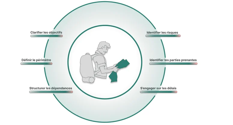 How to scope a project before you commit to a dateFraming is not paperwork. It is the last moment where a decision is cheap. Here is what a scoping stage has to produce before anyone opens a schedule.
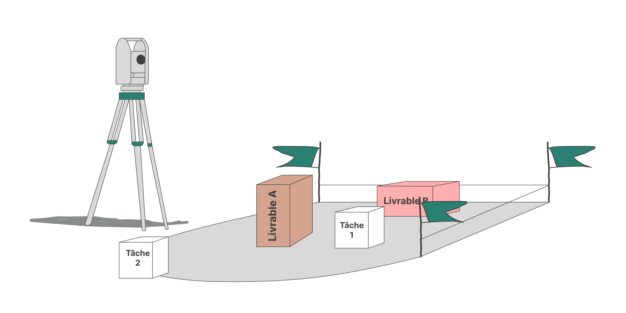 Scope creep: why projects grow without anyone decidingScope creep is rarely a single bad decision. It is the accumulation of small additions nobody logged, on a scope that was never fully written down.
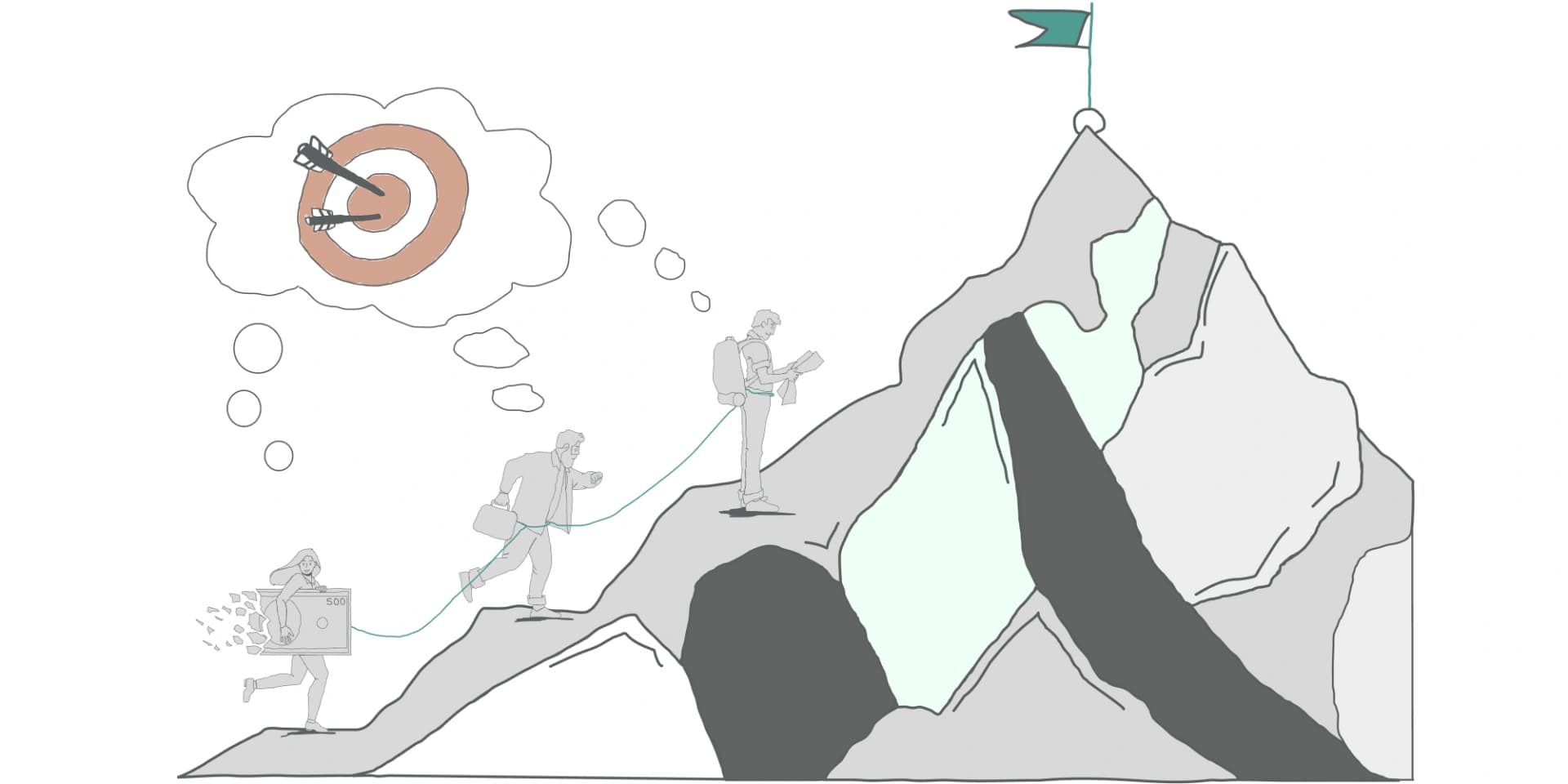 What is a project? Definition and life cycleA project is a temporary effort aimed at a unique outcome, delivered under constraints and uncertainty. Here is what that means in practice, and why the framing decides the outcome.
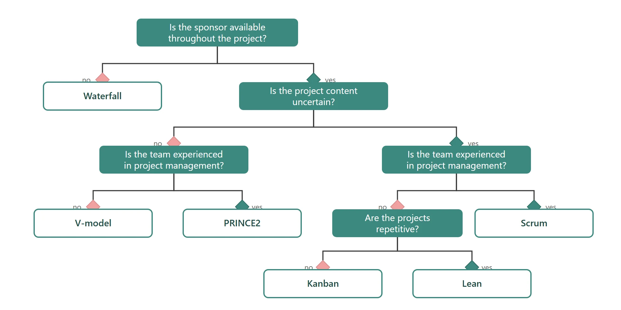 Project management methodologies: agile and traditional approachesWaterfall, V-model, PRINCE2, Scrum, Kanban, Lean: what each method fixes at the start, what it leaves open, and the situations where it holds.
Managing risks is pointless if the project is not built.
Without a breakdown and declared dependencies, nobody knows what a delay really pushes back. Break it down, link it up, calculate the date: free 30-day trial, no credit card.