Gantt Chart: The Method for Effective Project Tracking
Estimated reading time : 5 minKey takeaway:
You may think you're securing your deadlines with a Gantt chart, yet your projects still end up late or over budget. Here we explain why this planning tool becomes a source of confusion when it lacks solid methodological foundations like the WBS. Discover how to transform your approach and finally obtain a dynamic, reliable roadmap perfectly aligned with real-world constraints.
- Gantt Chart: the promise of a clear vision of your project
- The hidden foundations of a reliable Gantt chart
- The trap of the Gantt chart: when the tool becomes an illusion of control
- How to build a dynamic Gantt chart: the correct method explained
- Beyond the Gantt chart: adapting visualization to your needs
Gantt Chart: the promise of a clear vision for your project
What exactly is a Gantt chart?
The Gantt chart is a standard project planning visualization tool. It simply positions the tasks to be completed on a horizontal timeline.
It is so popular in project management because it provides an immediate visual roadmap. You can instantly read the progress status, which reassures teams.
Its apparent simplicity is its greatest strength, but also the source of its main weakness.
Anatomy of a Gantt chart: what are we actually reading?
The tool is divided into two distinct sections. On the left, you find the task list, ideally derived from a rigorous WBS (Work Breakdown Structure), and on the right, the graphical representation.
Horizontal bars fill the calendar: their length indicates task duration, while their position defines start and end dates.
At a glance, here are the key elements you are reading:
- Tasks and their precise duration.
- Dependencies between tasks, represented by arrows.
- Important milestones and assigned resources.
Who is this tool for?
The Gantt chart is a powerful communication tool. It acts as a shared calendar to align operational teams around a common production rhythm.
For the project manager, it serves as a true compass. It makes it possible to steer progress, anticipate deviations, and make decisions to secure deadlines.
Finally, for management and stakeholders, it provides an essential macro-view. It is a strategic reporting tool that reassures by presenting a clear roadmap.
The hidden foundations of a reliable Gantt chart
Many see the Gantt chart as a starting point. This is wrong. It is the result of structured thinking. Here are the two indispensable pillars for building it.
Step 1: The WBS to understand “what” needs to be done
The WBS (Work Breakdown Structure) is the essential first step. Its role is to break down the global project into manageable units. It is literally the skeleton of your future success. It lists everything that must be produced.
This method directly answers the question “What?”. Without this breakdown, you risk forgetting critical tasks or missing your target entirely. Estimating overall workload then becomes impossible.
This structure feeds directly into the left side of the Gantt chart. You must learn how to build a solid Work Breakdown Structure.
Step 2: PERT to determine “how” and “in what order”
Next comes the PERT diagram for logic. Its goal is to intelligently sequence the identified tasks and define the logical connections between them.
It answers the central question “In what order?”. This tool allows you to visualize blocking dependencies. A task cannot start until the previous one is completed. This is the key to building a dynamic dependency network.
This logic is widely recognized by academic experts and international reference organizations. It is also the foundation on which the PMI relies when issuing the PMP certification.
Step 3: The winning equation — WBS + PERT = Gantt
The Gantt chart is born from the fusion of the WBS and PERT. It is a visual synthesis of the project structure and represents the temporal logic.
Comparison of planning tools: WBS, PERT and Gantt chart
| Tool | Primary objective | Answers the question | Format |
|---|---|---|---|
| WBS | Break down the project into deliverables and tasks | "What?" | Tree structure |
| PERT | Sequence tasks and identify dependencies | "In what order?" | Network diagram (nodes and arrows) |
| Gantt | Visualize the schedule of tasks over time | "When?" | Bar chart on a timeline |
The trap of the Gantt chart: when the tool becomes an illusion of control
The bad habit: building a Gantt chart “on the fly”
You know the scene. A rushed project manager opens their software, sees an empty grid, and starts typing tasks. It feels reassuring, visual, and easy. So you dive in without asking questions.
Big mistake. Without the solid structure of the WBS and the logic of the PERT, your schedule is built on sand. The result is inevitably rigid, fragile, and incoherent.
Worst of all, most tools encourage this misleading practice by showing the Gantt chart as the starting interface.
The consequences of a poorly built schedule
A poorly structured Gantt chart is far more dangerous than having no schedule at all. It gives a false sense of control while chaos is actually building.
- Unrealistic deadlines from the start.
- Major risks not anticipated.
- Teams overloaded and under constant pressure.
- A schedule impossible to maintain over time.
Without method, the Gantt chart is not a project steering tool but a simple illusion of control that often leads straight into the wall.
Why is your Gantt chart always outdated?
It’s a mechanical issue. Without the dependency links from PERT, a delay in one task does not shift anything automatically. Everything remains frozen.
Project tracking turns into an administrative nightmare. The project manager wastes time manually adjusting dozens of bars, and the Gantt chart becomes outdated very quickly. This undermines the key qualities required for effective project management.
The Gantt chart becomes a dead document — just a snapshot at a specific moment. Yet it should be a living steering tool.
Building a dynamic Gantt chart: the correct method explained
The diagnosis is harsh, but the solution exists. The goal is not to abandon the Gantt chart, but to build it intelligently, following a method-driven approach.
Change your perspective: the Gantt chart is a result, not a starting point
The key is to see the Gantt chart for what it truly is: a visual representation of a well-designed plan. It is the final step of the planning process, not the first.
The correct approach is always the same: 1) Structure the work (WBS), 2) Define dependencies (PERT), 3) Estimate durations and resources, 4) Generate the Gantt chart.
This method ensures a flexible, adjustable, and reliable schedule throughout the project.
Tools that actually help you
Many popular tools like Monday or Asana present you with a blank page. This is a trap for non-experts, encouraging them to fill in tasks without method and leading straight to errors.
Others, like Excel, are simply not designed for this. You must simulate a Gantt chart using stacked bar charts — tedious and completely static.
The right tool does not give you an empty Gantt chart to fill. It guides you to build it correctly, following the method that makes it truly useful.
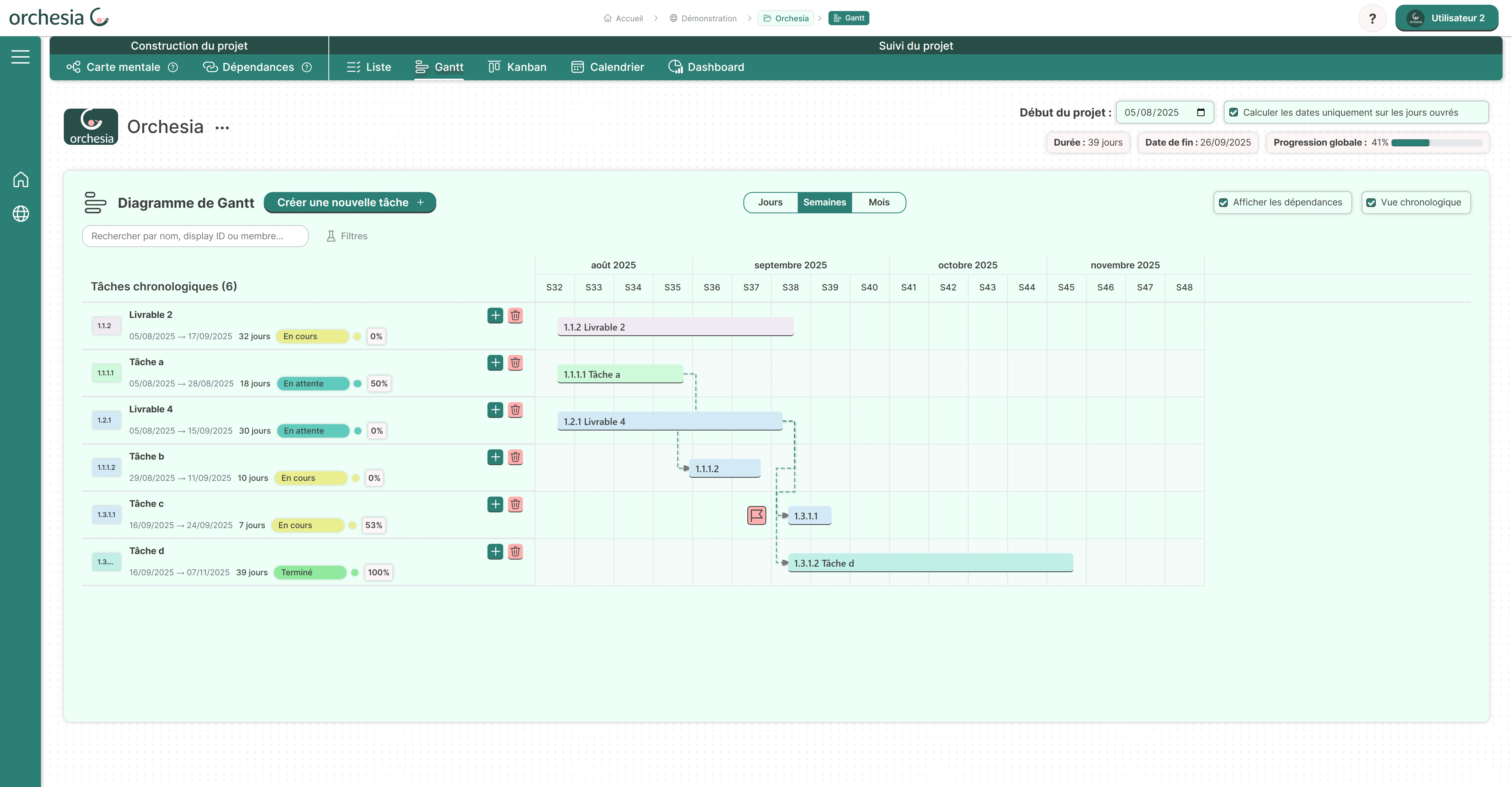
The guided approach: the Orchesia example
The Orchesia approach illustrates this correct method. The goal is not to advertise, but to show how a software can embed the method to secure your project.
Instead of a blank Gantt chart, Orchesia offers dedicated tabs: a mind map for the WBS and a dependencies module for PERT. These tools are visual and intuitive.
The Gantt chart is then generated automatically, ensuring consistency and flexibility.
Beyond the Gantt chart: choosing the right visualization
A well-built Gantt chart is undeniably powerful. But it is not always the best view for day-to-day project steering. A good management system should allow you to switch perspectives effortlessly.
Gantt, Kanban, List: each view has its use
The Gantt chart is perfect for initial planning and deadline tracking. It answers the question “When?” and visualizes the overall timeline.
For daily workflow management, a Kanban board is often more suitable. It shows task status and helps manage team workload — ideal for applying agile principles day-to-day.
A simple task list may be enough for personal tracking or very small projects without complex dependencies. Sometimes, simplicity wins.
The importance of a flexible tool
The real power lies in the ability to switch from one view to another without losing information. The data remains the same — only the representation changes instantly.
This allows the project manager to use the Gantt view for strategic reporting, while the technical team may prefer a Kanban board for their weekly sprint. Everyone keeps their bearings.
Flexibility is the hallmark of modern and effective project management tools. It provides several major advantages:
- Improved communication between stakeholders.
- Real adaptation to team working preferences.
- A complete view of the project from multiple complementary angles.
The Gantt chart should never be a mere illusion of control. To become a true steering lever, it must rest on solid foundations: WBS and PERT. By adopting this structured approach, you transform your planning into a reliable and dynamic strategic asset.
FAQ
What is the fundamental principle of the Gantt chart?
The core principle of the Gantt chart is to offer an immediate visual representation of a project's timeline. It usually consists of two parts: the left side lists tasks hierarchically (often derived from the WBS), while the right side displays them as horizontal bars across a calendar. Its promise is to show, at a glance, what is planned, what is in progress, and any delays or advances.
What is the difference between a Gantt chart and a PERT chart?
The difference lies in their primary function: PERT manages logic, while Gantt manages time. The PERT diagram sequences tasks by defining dependency links (which task must be completed before another starts) — answering the question “In what order?”. The Gantt chart places these tasks on a calendar — answering the question “When?”. For accuracy, a Gantt chart should always be the result of a PERT-based sequence.
How do you build an effective Gantt chart?
Contrary to popular belief, you do not start by drawing bars. To build a robust Gantt chart, you must follow a two-step rigorous method: first structuring the project with the WBS (Work Breakdown Structure) to list tasks exhaustively, then sequencing them with the PERT diagram to establish dependencies. The equation “WBS + PERT = Gantt” produces a coherent and actionable schedule.
Can you create a viable Gantt chart in Excel or Word?
Technically, it is possible to create a graphical representation in Excel or Word, but it is strongly discouraged for real project tracking. These tools are static: they cannot handle logical dependencies between tasks. If one date changes, you must manually shift all subsequent bars — tedious and error-prone. You end up with a static picture, quickly outdated, instead of a real dynamic tracking tool.
What are the main drawbacks or limitations of the Gantt chart?
The main limitation of the Gantt chart is not the tool itself but its misuse without proper methodology. Built “on the fly” without WBS or PERT, it becomes an “illusion of control”: deadlines are unrealistic, and the schedule does not adapt to unexpected events since tasks are not dynamically linked. In very complex projects, it may even become visually overloaded, making dependencies harder to read.
Which tool should you choose to automatically generate your Gantt chart?
It is best to avoid tools that present an empty grid to fill manually, as they encourage skipping the structuring steps. Choose a solution (like Orchesia’s approach) that guides you through building a mind map (WBS) and defining dependencies (PERT). The tool should then be able to automatically generate the Gantt chart, ensuring a reliable and flexible schedule.
What exactly does a Gantt chart allow you to visualize?
A well-built Gantt chart provides three major visualizations: the hierarchical structure of tasks (who does what), the temporal sequencing (durations, start and end dates), and the project dynamics through dependency links. It is a powerful communication tool to reassure stakeholders about the roadmap while serving as a daily compass for operational teams.
Try our project management software Orchesia free for two weeks, no commitment!